Tuesday, April 27, 2010

Effects on the Economy: Does it Matter Which Political Party is in Power?

In light of the United State's current economic condition, one should consider how voting for a particular party affects the overall state of the country's economy. Republicans and Democrats both accuse the opposing party of causing economic downturns. Republicans argue that the Democrats' increased government spending and regulation of industry stifles the economy. On the other hand, Democrats argue that the Republicans goal to deregulate private industry encourages businesses to take dangerous risks that could potentially harm the nation's economy as a whole.

So which party has it right? Under the leadership of which party does the U.S.'s economy thrive or decline?

Using a data set from the Bureau of Economic Analysis (BEA), I was able to compile a list of both the annual and quarterly change in GDP since 1930. I then created a variable for the President's party for every year in the data set (1 for a Democratic president and a 2 for a Republican president).

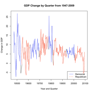
I then began comparing the change in GDP under Democratic Presidents to the change in GDP under Republican Presidents. The first figure tracks the change in GDP in each quarter from 1947 to 2009. When the line is blue, a Democratic president was in office and when the line is red, a Republican president was in office.


This figure is simply a time line of GDP growth and decline and fails to help answer the question. One simply cannot tell if there is more growth under Democratic leadership or under Republican.

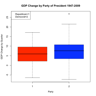
The second figure presents a boxplot that compares the GDP quarterly change under Republican Presidents (red) versus Democratic Presidents (blue).


What is revealed in the boxplot is that under Democratic leadership there is a slightly larger mean GDP growth. This means that under a Democratic president there is slightly more growth in GDP. Also, the upper-quartile of the Democratic (blue) boxplot is greater than the upper-quartile of the Republican (red) boxplot. This means that the greatest growth in GDP since 1947 was experienced under the leadership of a Democratic president. Although both of these findings are intriguing, they are hardly evidence that the economy fairs better under Democratic leadership.


The third figure is a collection of scatterplots. Each scatterplot represents a sequence of time when the country was under either Democratic or Republican leadership. I plotted GDP quarterly change over time and added a reference line to help the viewer see whether there was either GDP growth or decline. The blue plots represent a length of time when a Democrat was president and the red plots represent a length of time when a Republican was president.


The main observation from these sequence of plots is that there is an equal amount of growth and decline under Democratic and Republican presidents. From the plots, it appears that when there is decline under a Democratic president, it is followed by a period of decline under a Republican president. When there is growth under a Democratic president, it is followed by a period of growth under a Republican president. This pattern is found in all but the last two plots. In the 1994-2001 plot (Bill Clinton-Democrat), GDP growth was detected. However, this period of growth under a democratic president was followed by a period of GDP decline from 2002-2009 under a republican president (George W. Bush). Overall, this sequence of plots is informative and it suggests that the economy fairs equally well under the leadership of either party.

In the fourth figure, I compare the distribution of GDP change under Democratic presidents (blue) to the distribution of GDP change under Republican presidents (red).


What is most obvious from these two histograms is that the distribution of GDP change under either Democratic or Republican presidential leadership appears to be essentially the same. Both distributions are centered around 5 percent GDP growth. Both distributions have cases of extreme GDP growth and decline. Of course, looking at distributions presented in histograms can be misleading, because the number of bins can change the appearance of the distribution drastically.

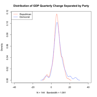
In order to better compare the two distributions, I created a fifth figure that plots the kernel density distribution for GDP Quarterly change under both Republican and Democratic presidencies. The blue line represents the distribution under Democratic leadership and the red line represents the distribution under Republican leadership.


What is most immediately obvious is that the distribution of GDP quarterly change under either democratic or republican presidents is the same. In fact, the two distributions are almost identical. The main differences are that under Republican presidencies there are more cases of the mean growth. Also, the democratic distribution has more cases of extreme growth, which can be observed in its upper tail. This, however, does not serve as evidence that the country does better under Democratic rule. Other than those two differences the distributions are pretty much the same.

These visualizations suggest that the party that controls the executive branch does not determine whether the U.S. economy will thrive or decline. Under the leadership of both parties the economy experienced times of growth and times of decline.

Link to data: http://www.bea.gov/national/index.htm

R Code:
##Loading Data

econ<-read.csv("/Users/carrielevan/Documents/Geo299/EconomicHW/GDPchange.csv")

library(car)


NOTE: For some reason my code under "preparing the data" keeps changing once I post. I've tried it three times and don't know why it changes. If you want the exact code, email me and I will give it to you.


##Preparing the Data

#Subsets of GDP Quarter Change by Party in Power

dem1<-subset(econ$GDPQuarterChange, econ$Quarter<>

rep1<-subset(econ$GDPQuarterChange, econ$Quarter>19534 & econ$Quarter <>

dem2<-subset(econ$GDPQuarterChange, econ$Quarter>19614 & econ$Quarter <>

rep2<-subset(econ$GDPQuarterChange, econ$Quarter>19694 & econ$Quarter <>

dem3<-subset(econ$GDPQuarterChange, econ$Quarter>19774 & econ$Quarter <>

rep3<-subset(econ$GDPQuarterChange, econ$Quarter>19814 & econ$Quarter <>

dem4<-subset(econ$GDPQuarterChange, econ$Quarter>19814 & econ$Quarter <>

rep4<-subset(econ$GDPQuarterChange, econ$Quarter>19934 & econ$Quarter <>

dem4<-subset(econ$GDPQuarterChange, econ$Quarter>19934 & econ$Quarter <>

rep4<-subset(econ$GDPQuarterChange, econ$Quarter > 20004)


#Creating Subset of Quarter Dates

demQ1<-subset(econ$Quarter, econ$Quarter <>

repQ1<-subset(econ$Quarter, econ$Quarter>19534 & econ$Quarter <>

demQ2<-subset(econ$Quarter, econ$Quarter>19614 & econ$Quarter <>

repQ2<-subset(econ$Quarter, econ$Quarter>19694 & econ$Quarter <>

demQ3<-subset(econ$Quarter, econ$Quarter>19774 & econ$Quarter <>

repQ3<-subset(econ$Quarter, econ$Quarter>19814 & econ$Quarter <>

demQ4<-subset(econ$Quarter, econ$Quarter>19934 & econ$Quarter <>

repQ4<-subset(econ$Quarter, econ$Quarter > 20004)


##FIgure 1

#Line Plot with Different Party in Power lines

plot(econ$Quarter, econ$GDPQuarterChange, xlab="Year and Quarter", ylab="Change in GDP", main="GDP Change by Quarter from 1947-2009", type="l")

lines(demQ3, dem3, col="blue")

lines(demQ4, dem4, col="blue")

lines(demQ2, dem2, col="blue")

lines(demQ1, dem1, col="blue")

lines(repQ2, rep2, col="red")

lines(repQ1, rep1, col="red")

lines(repQ3, rep3, col="red")

lines(repQ4, rep4, col="red")


legend("bottomright", c("Democrat", "Republican"), col=c("blue", "red"), lty=1:2)


##Figure 2

#Boxplot

boxplot(GDPQuarterChange~PID, data=econ, ylab="GDP Change by Quarter", xlab="Party", main="GDP Change by Party of President 1947-2009", col=(c("red", "blue")))

legend("topleft", c("Republican=1", "Democrat=2"))

##Figure 3
#Plots on One Image

par(mfrow=c(2,2))


plot(demQ1, dem1, type="p", xlab="Year and Quarter", ylab="GDP Change by Quarter", main="GDP Change under Democratic President 1947-1953", col="blue")

abline(lm(dem1~demQ1), col="blue")


plot(repQ1, rep1, type="p", xlab="Year and Quarter", ylab="GDP Change by Quarter", main="GDP Change under Republican President 1954-1961", col="red") abline(lm(rep1~repQ1), col="red")


plot(demQ2, dem2, type="p", xlab="Year and Quarter", ylab="GDP Change by Quarter", main="GDP Change under Democratic President 1962-1969", col="blue")

abline(lm(dem2~demQ2), col="blue")


plot(repQ2, rep2, type="p", xlab="Year and Quarter", ylab="GDP Change by Quarter", main="GDP Change under Republican President 1970-1977", col="red")

abline(lm(rep2~repQ2), col="red")


par(mfrow=c(2,2))


plot(demQ3, dem3, type="p", xlab="Year and Quarter", ylab="GDP Change by Quarter", main="GDP Change under Democratic President 1978-1981", col="blue")

abline(lm(dem3~demQ3), col="blue")


plot(repQ3, rep3, type="p", xlab="Year and Quarter", ylab="GDP Change by Quarter", main="GDP Change under Republican President 1982-1993", col="red")

abline(lm(rep3~repQ3), col="red")


plot(demQ4, dem4, type="p", xlab="Year and Quarter", ylab="GDP Change by Quarter", main="GDP Change under Democratic President 1994-2001", col="blue")

abline(lm(dem4~demQ4), col="blue")


plot(repQ4, rep4, type="p", xlab="Year and Quarter", ylab="GDP Change by Quarter", main="GDP Change under Republican President 2002-2009", col="red")

abline(lm(rep4~repQ4), col="red")


##Figure 4

#Preparing the Data

REP1<-subset(econ$GDPQuarterChange, econ$QuarterPID==1)

DEM1<-subset(econ$GDPQuarterChange, econ$QuarterPID==2)


dREP1<-density(REP1)

dDEM1<-density(DEM1)


#histogram

par(mfrow=c(2,1))

hist(DEM1, col="blue", main="Histogram of GDP Quarterly Change Under Democratic President", xlab="GDP Quarterly Change", breaks=15)


hist(REP1, col="red", main="Histogram of GDP Quarterly Change Under Republican President", xlab="GDP Quarterly Change", breaks=15)


##Figure 5

plot(dREP1, main="Distribution of GDP Quarterly Change Separated by Party", col="red", xlim=c(-40,40))

lines(dDEM1, col="blue")


legend("topleft", c("Republican", "Democrat"), col=c("red", "blue"), lty=1:1)


No comments:

Post a Comment

Followers